Campbell Rochford Branding & Guidelines
Campbell Rochford is a specialist Financial Services Recruitment company focussing on the recruitment needs of Banks, Insurers and Finance clients and candidates. Their aim is to grow the business incrementally each year by monetizing the goodwill and experience of previously working with select Financial Services clients.
The new logo needed to reflect a serious, professional company, one that gives a feel of a well-established firm with a reputation to match. Campbell and Rochford were names of late relatives of the company founder and the name was chosen to carry their legacy forward.
Some of the original logo concepts Clare Lynch Creative developed focussed on representing this unique heritage story of Campbell Rochflord, incorporating the C and R from the words Campbell Rochford to create a strong graphic corporate symbol and a recognisable brandmark.
As development continued with the client, we decided to take another direction playing on the word ‘great’ using a direct connection with accounting and the ‘greater than’ mathematical symbol to form a graphic element.
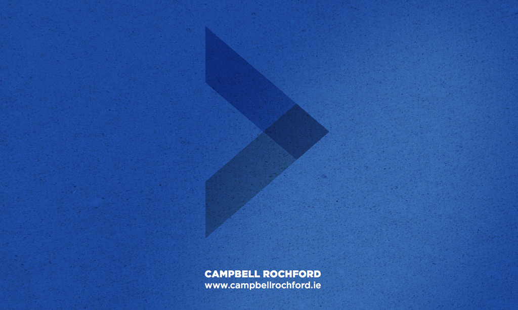
Campbell Rochford represents all that is great. They work with great staff and help people and companies connect to become greater. The strong graphic corporate mark created in the logo symbolises two entities being connected by Campbell Rochford (who are the centre-point in the connection). It also doubles-up to represent a positive step forward symbol for candidates / clients alike.
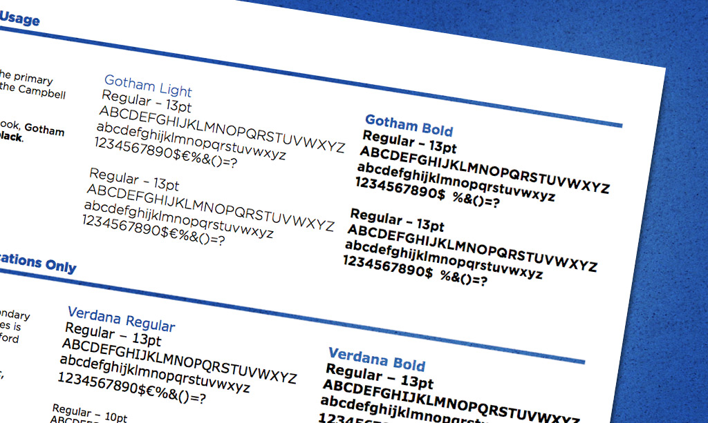
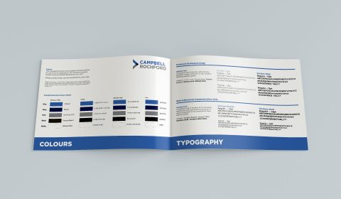
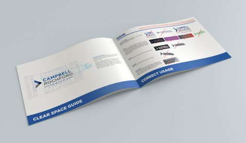
The overlapping and linking of the shape & colours in the symbol here represent the links and connections constantly flowing with Campbell Rochford and their clients and candidates. This symbol is a strong brandmark which evokes the feel of a quality and established company, keeping it simple and clean with a sophisticated feel. The font used is modern and clear, with a touch of elegance and the colour palette chosen convey the values Campbell Rochford aim to represent of trust, professionalism and confidence.
“I’m delighted with how my logo turned out and having shown it to people since, everyone was really impressed. The logo really helped my website and I’m glad it looks a lot more professional as a result. I also ordered my first batch of business cards so thank you very much for your advice in this regard on the print”.
Gerard Quinlivan – Director,
Campbell Rochford














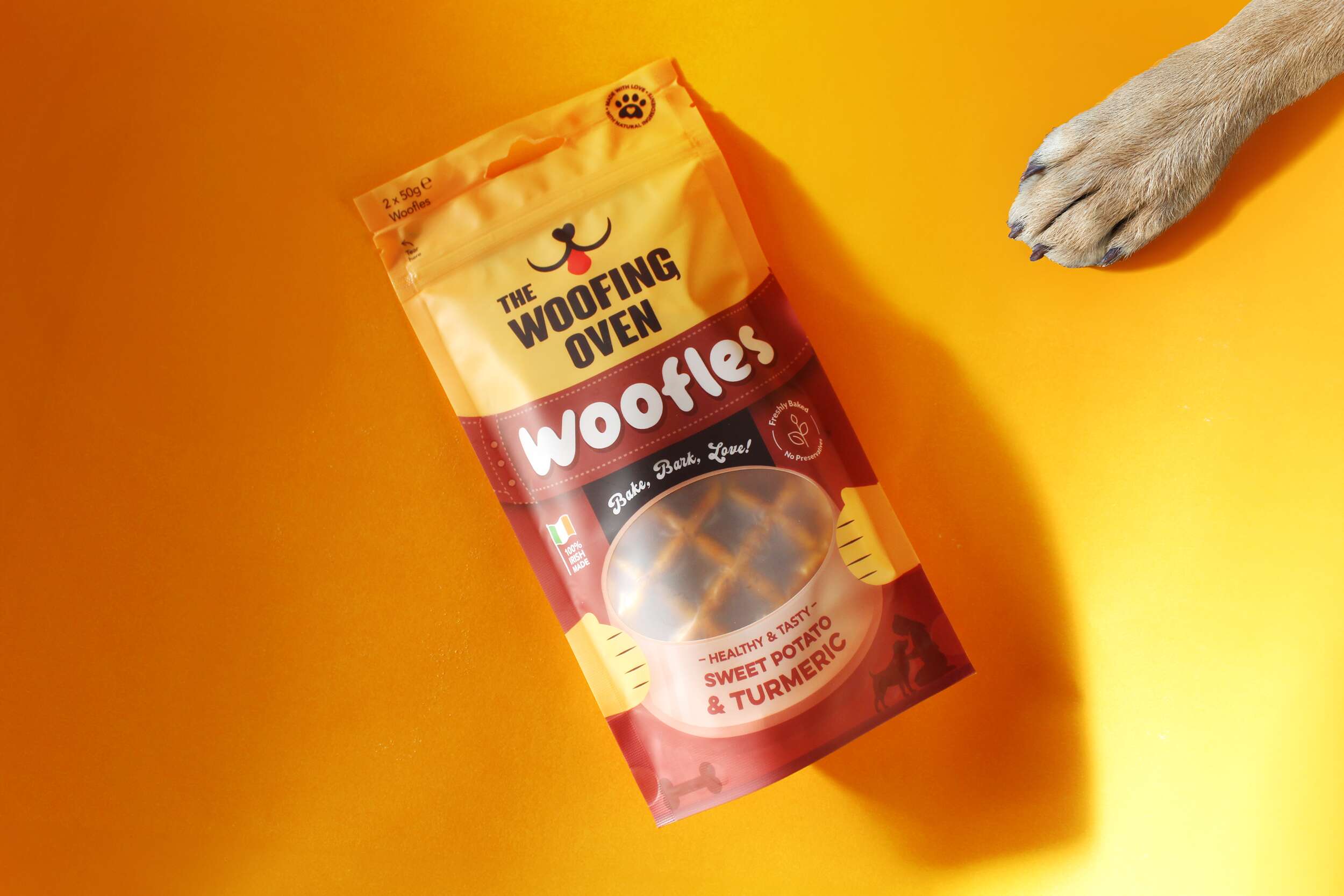
 The Woofing Oven’s packaging design challenge was to create a visually striking, retail-ready package that reflects the brand’s fun, celebratory nature while emphasizing its commitment to quality, natural ingredients, and Irish craftsmanship. The existing brand (formerly known as Bon A Pet Treats) needed a fresh identity that would stand out in a crowded dog food aisle, making the transition from local markets to mainstream retail.