dublinbikes Brochure
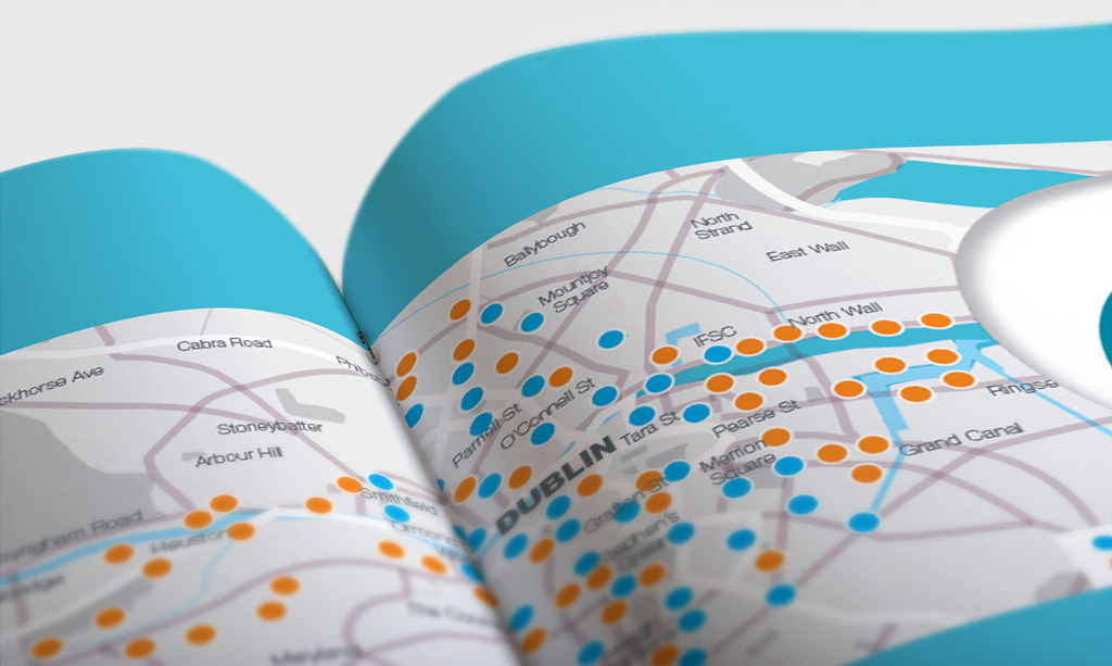
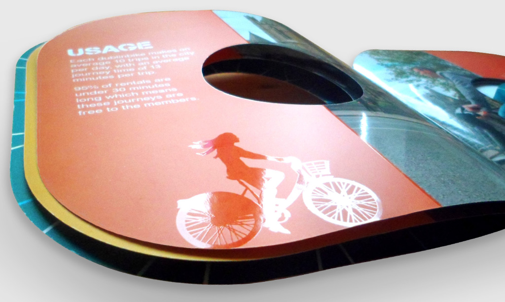
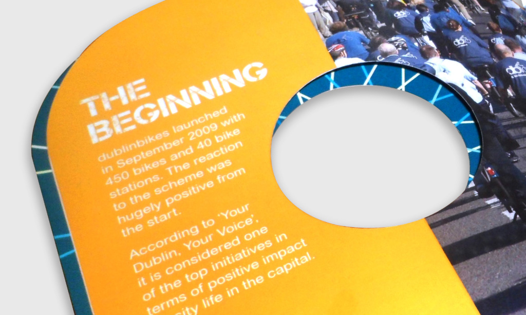
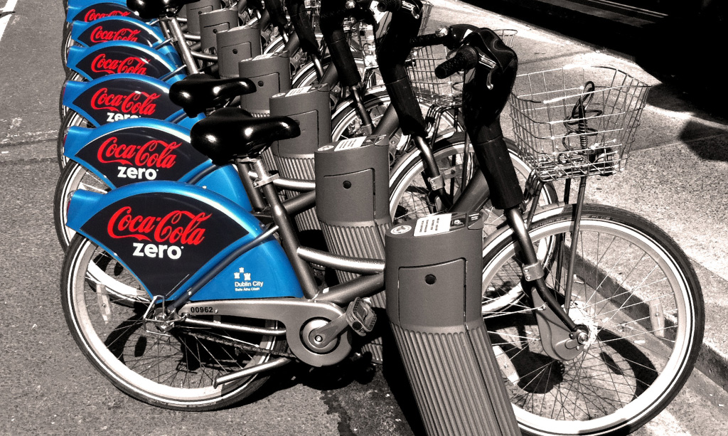
dublinbikes were celebrating their fifth birthday and are constantly looking for new ways to grow to expand their success. To mark their 5th birthday, they saw an opportunity on the mud-guards of the bikes where they could partner with a sponsor / partner to feature their brand on them, which would be an excellent advertising opportunity for a potential sponsor, as dublinbikes have become a strong presence in and around central Dublin.
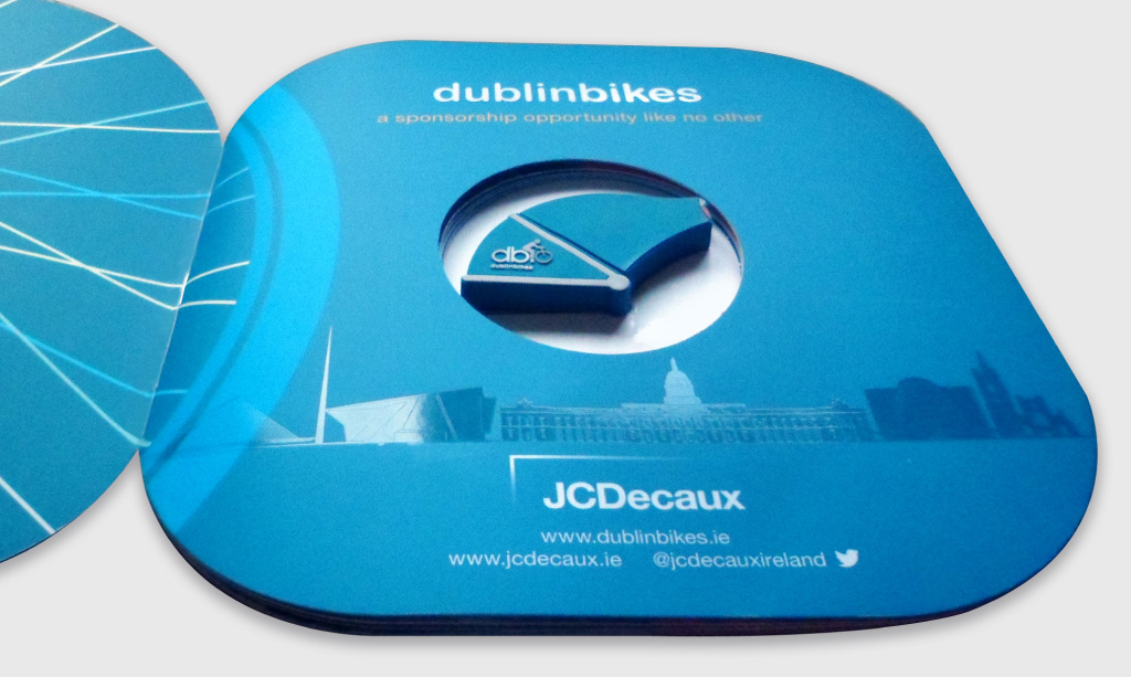
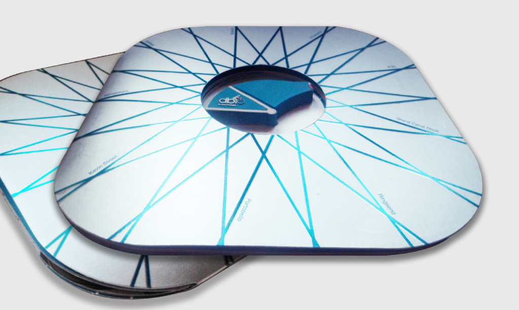
They decided they need a brochure to use as a sales aid / point of reference to companies and agencies that they were aiming to approach. The brochure needed to hold a USB stick featuring the presentation with further information on the package which was on offer. This brochure needed to look different and be visually appealing to display how unique this advertising opportunity with dublinbikes could be.
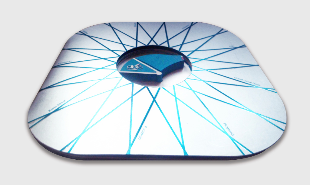
As an important factor of this brief was to stand out as unique from a standard brochure, the shape was an important factor in achieving this. To highlight further attention to what dublinbikes were offering, the bike’s shape and materials were key in creating this piece. The brochure features rounded corners, drawing similarities with the round shape of the wheels of the bikes, whilst still leaving the actual brochure shape area large enough to feature the text and images that needed to be included.
The aim was to draw attention to both the mudguard and the presentation, therefore the die-cut out centre circle really draws the eye in to mud-guard shaped USB containing the presentation. The front and back cover design feature spokes which again connect with the theme of the bike and also draw the eye further in to the centre of the piece, highlighting the unique selling point of the branded mudguard-shaped USB displayed within. Throughout the brochure, landmarks of Dublin are depicted on each spread, with illustrations of various commuters on bikes highlighted in Spot UV throughout to enhance their attraction to the target audience, while keeping other areas with a clean matte finish.
The cover is made up of a metallic mirror board which has a number of benefits including connecting with the metallic spokes of the bikes, being highly appealing and different visually and being of strong enough support to hold the USB key, which is held in place on the back cover with a small glue dot. The font chosen for the headlines connects with the typography used on cycle tracks around Dublin.
The result is a bright, fun brochure and strong sales tool which succeeded in easily attracting the attention of the potential target audience and gaining a sponsor – Coke Zero who are now a proud feature of dublinbikes.
*Completed whilst working for JC Decaux
