Grásome! Award-Winning Brownies: Brand Packaging Design
Grásome! is an artisan award-winning brand born out of the passion for creating luxurious gluten-free treats that are not only delicious but also fun and playful. Ruth, the founder, draws inspiration from her rich French-Irish heritage, her personal baking journey, and her love of good food. The brand’s mission is to provide indulgent, hand-crafted treats made from the finest natural ingredients, all while bringing a smile to the consumer’s face. With a tagline that reads “Gorgeously Gluten Free,” Grásome! speaks to those seeking both high-quality and allergy-conscious products without compromising on taste or style.
The name Grásome! perfectly encapsulates the essence of the brand, combining the Irish word “Grá” (meaning “love”) with a playful twist on the word “awesome.” The result is a name that feels both familiar and exciting, resonating with Ruth’s fun, vibrant personality. It’s a brand that isn’t afraid to be glamorous yet unpretentious, offering gluten-free indulgences with a wink of fun and light-heartedness. The nod to her influential aunt Gráinne, a passionate coeliac, baker and advocate for gluten-free products, adds a personal touch to the name, reinforcing the love and care behind every product.

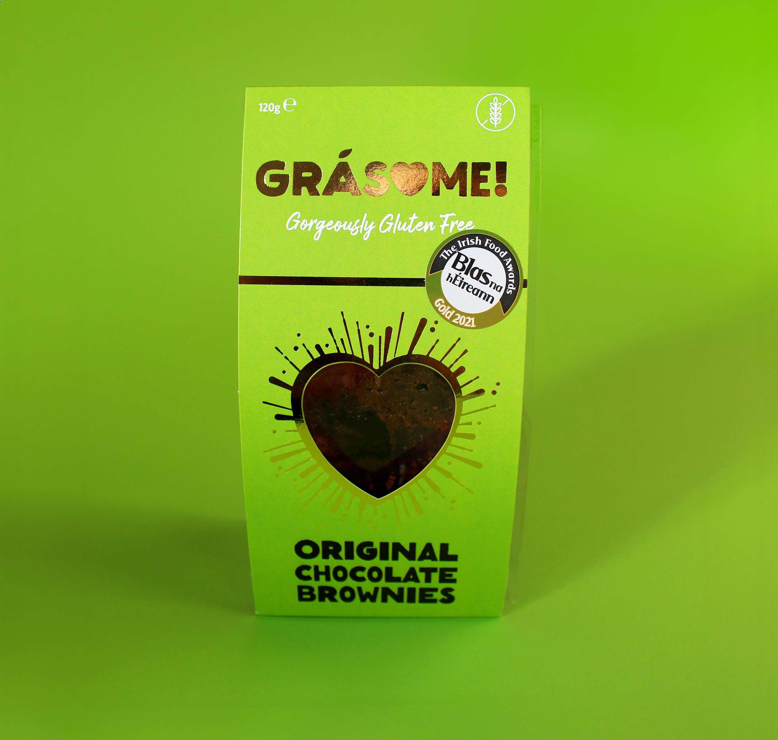
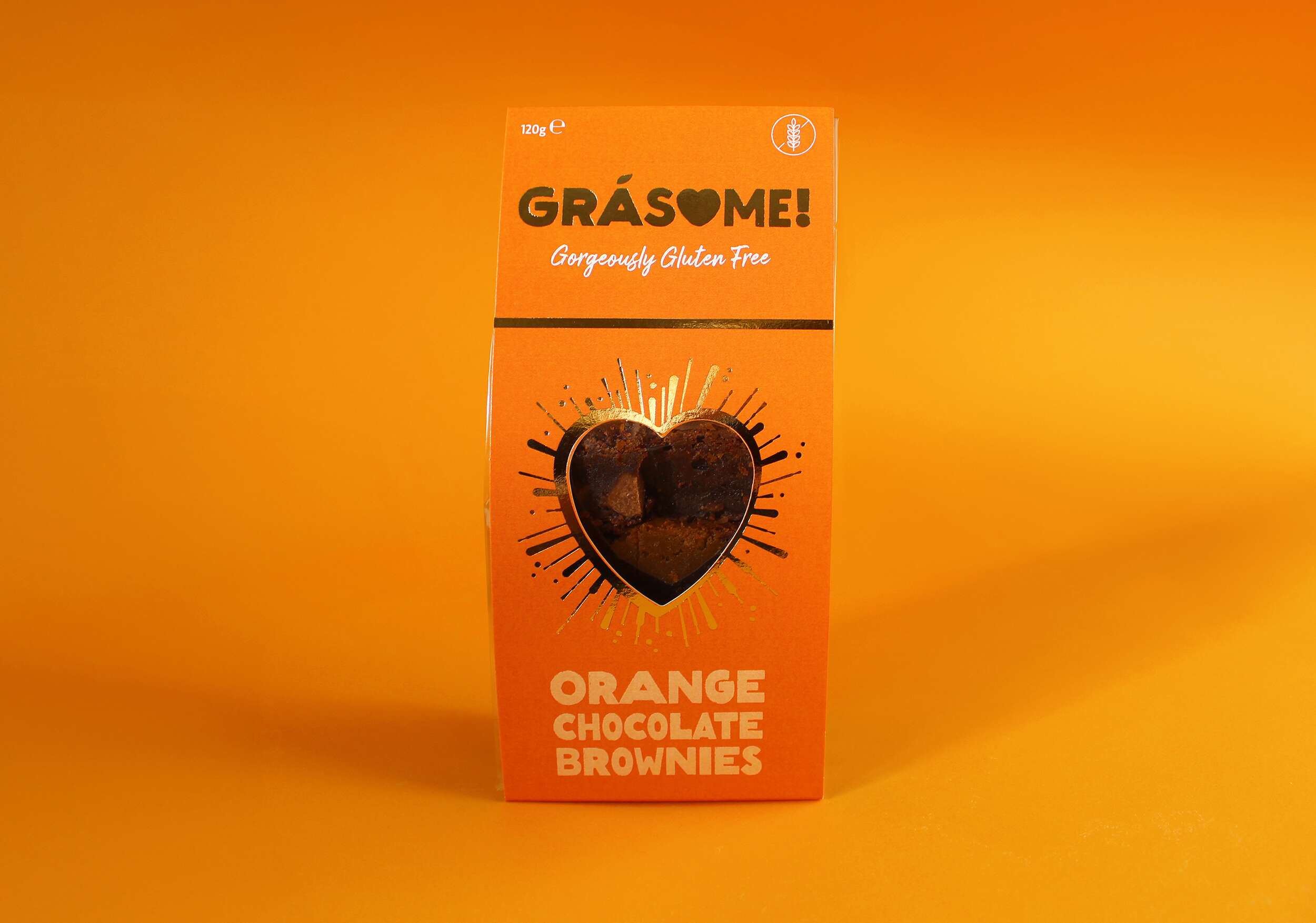
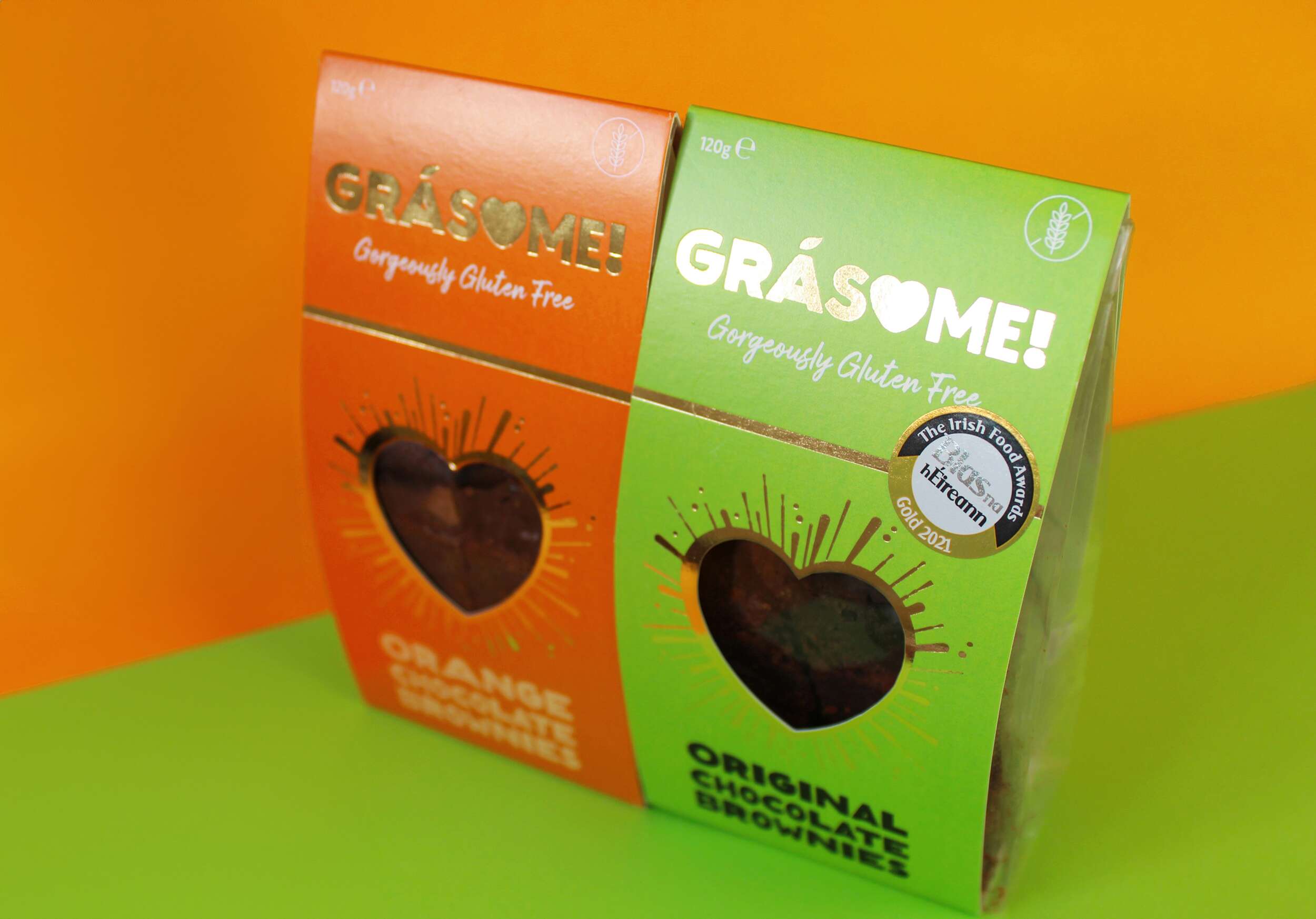
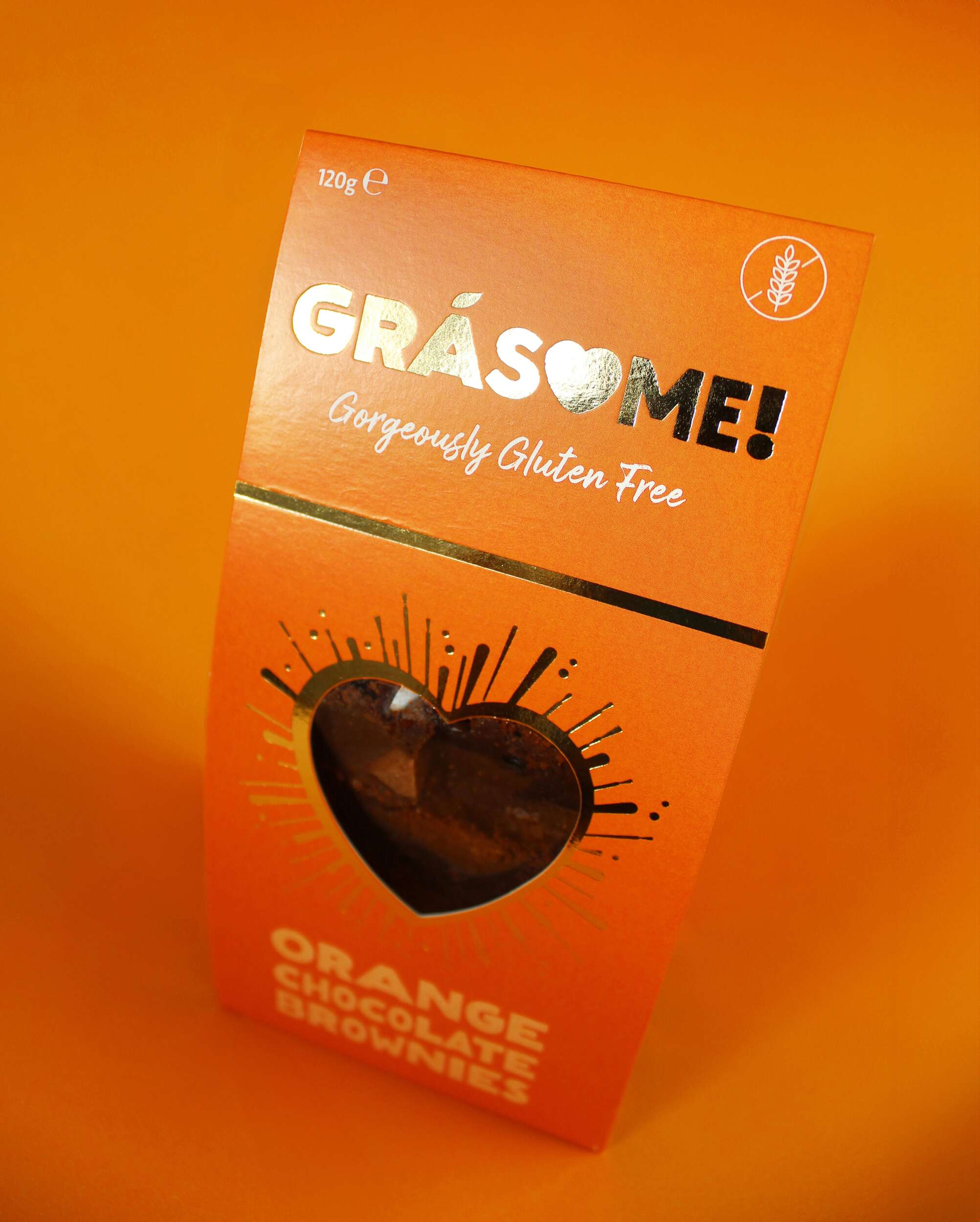
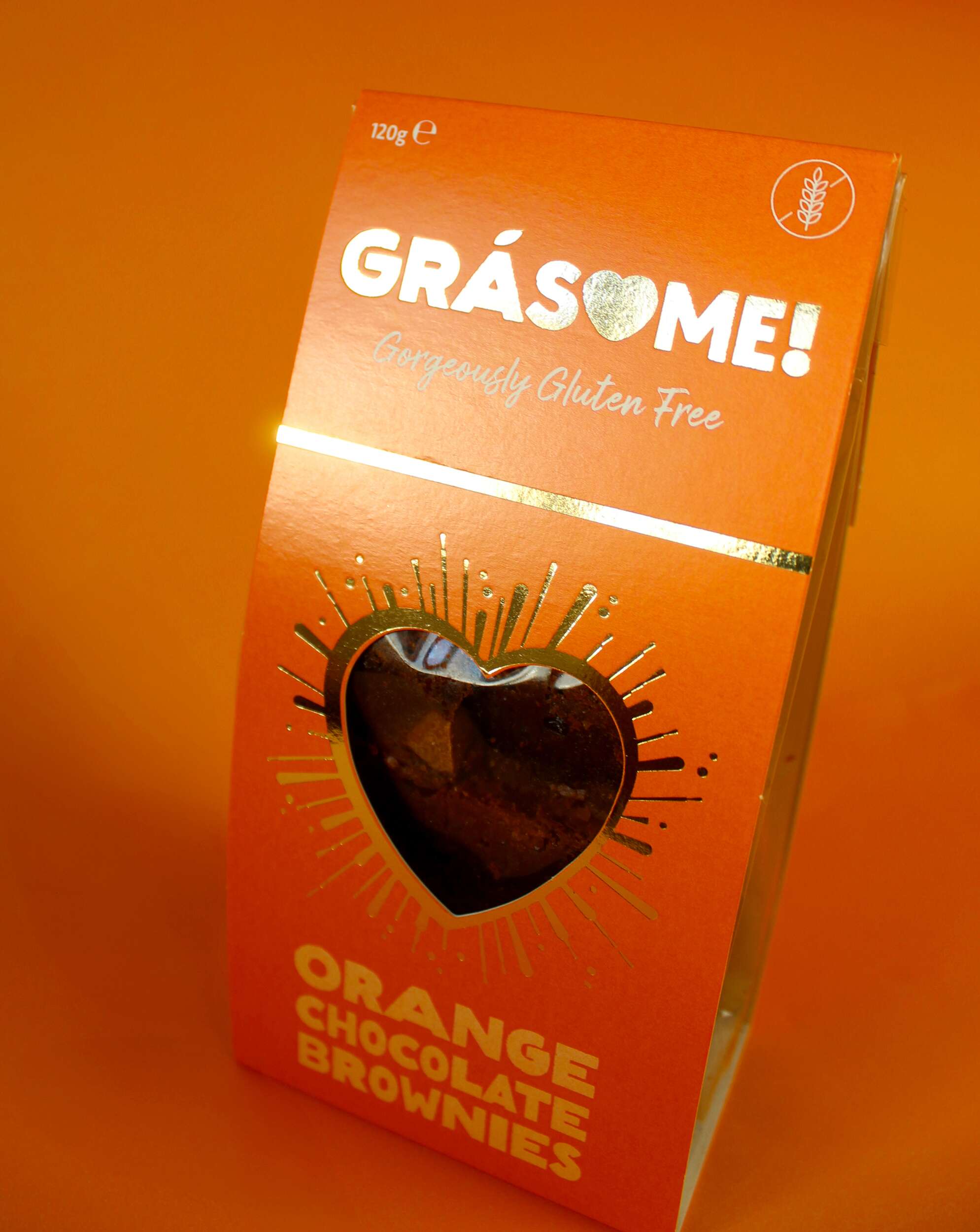
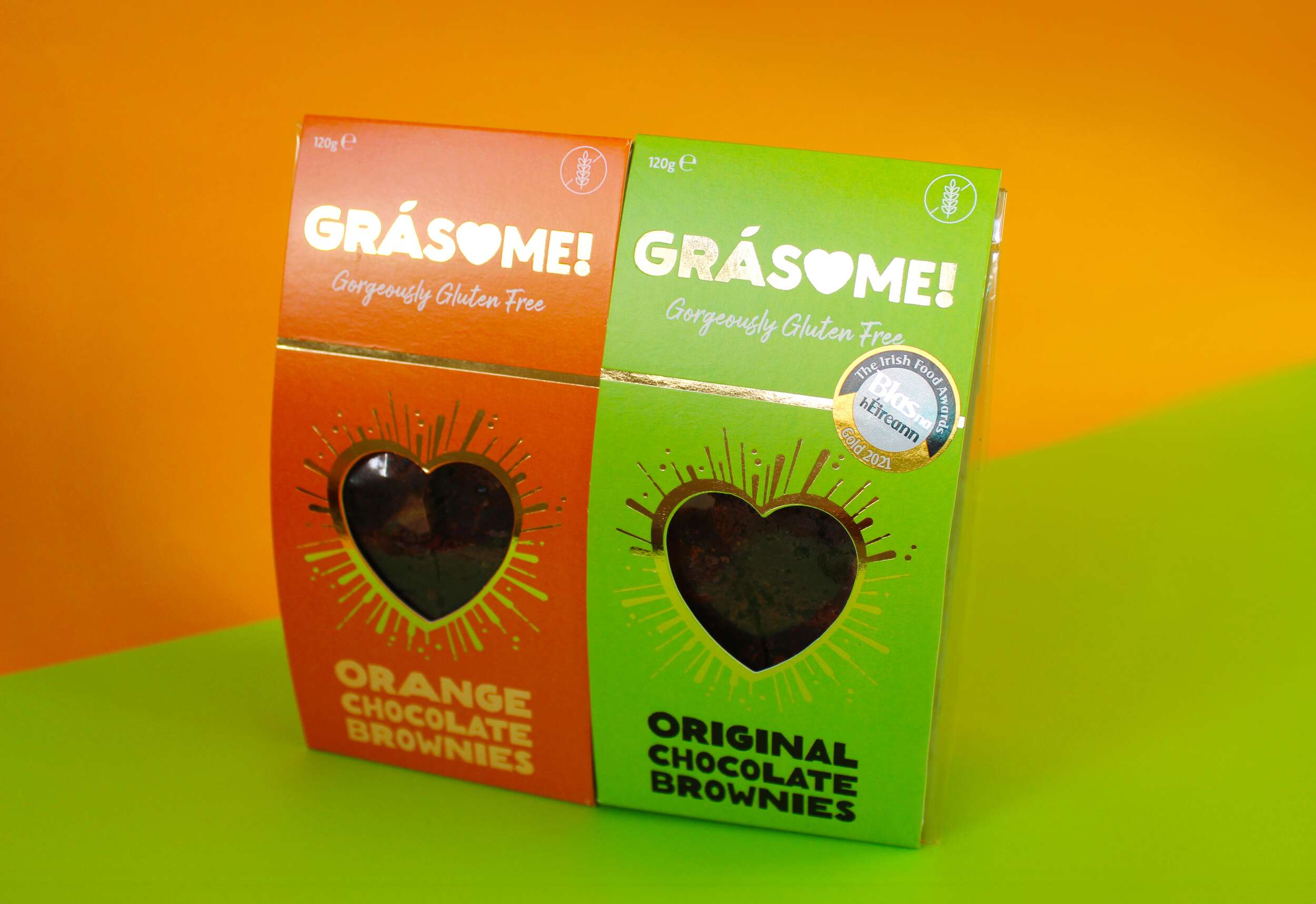
Grásome! stands out not only for its delectable products but also for its strong, memorable visual identity. We approached the branding with the goal of blending luxury, fun, and warmth – all key aspects of the product’s personality. The product flavour names incorporate a rustic, earthy font that mimics the textures found in brownies, cakes, and baking, emphasising the hand-made nature of the products. The letter ‘O’ is cleverly replaced with a heart, signifying both love and the personal care that goes into every batch. The fada (accent) on the ‘a’ is stylized as a leaf, symbolising the brand’s use of natural ingredients. The exclamation mark at the end of the name encapsulates the brand’s energetic, fun vibe, tying back to the playfulness of the word “awesome.” The tagline “Gorgeously Gluten Free” sits beneath the brand name in a handwritten font, reinforcing the personal, hand-crafted element of the brand while also making the gluten-free aspect clear and prominent.
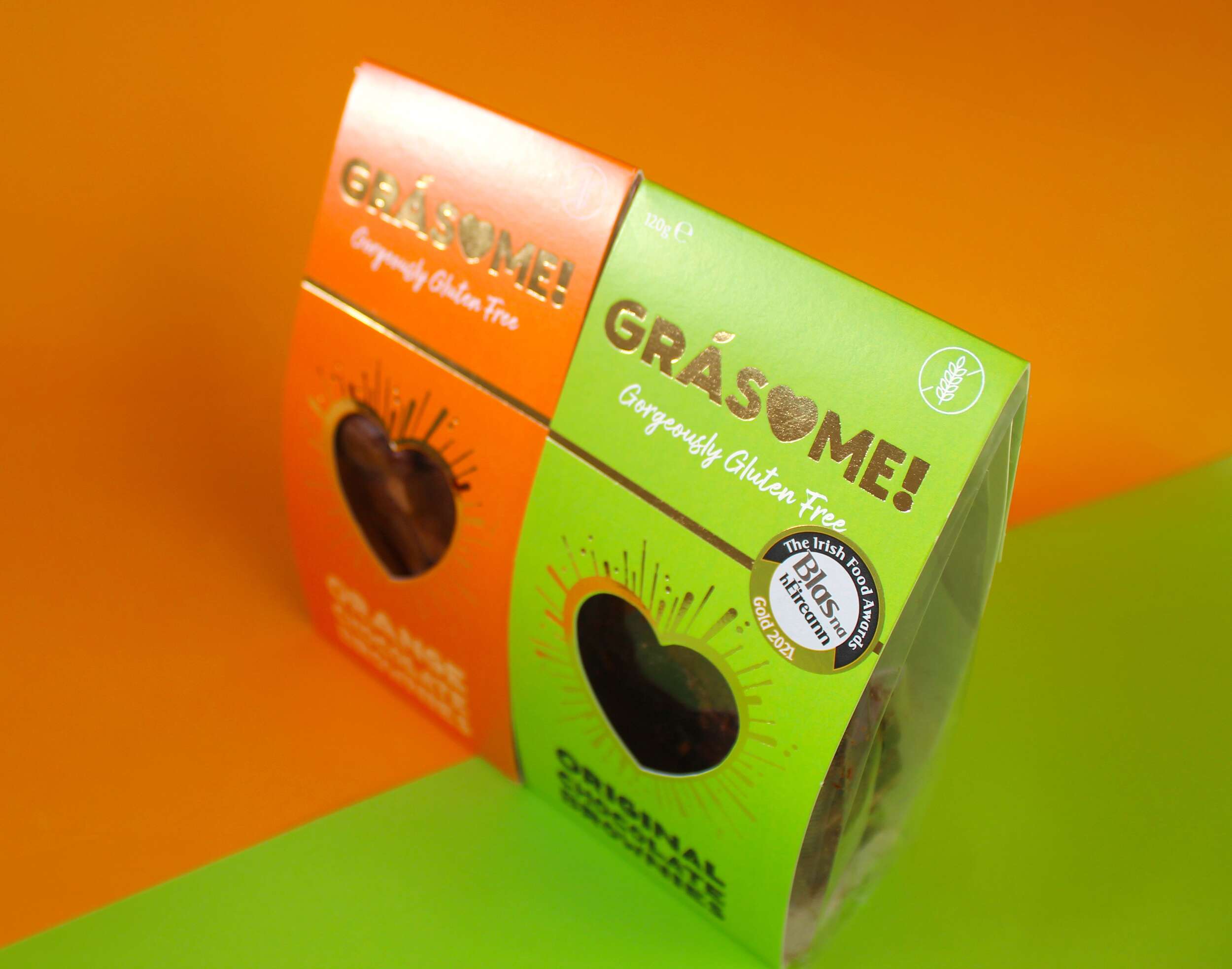
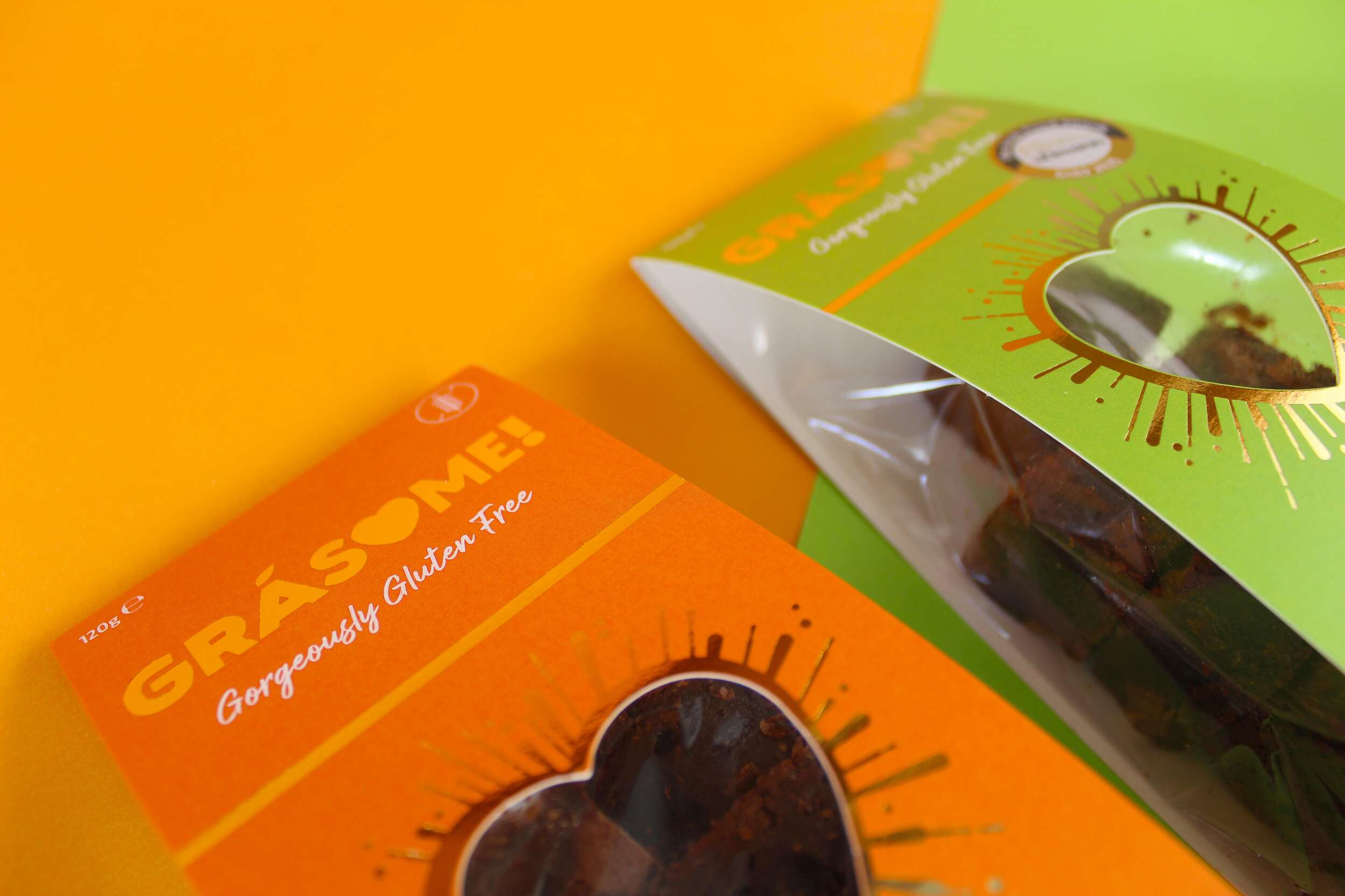
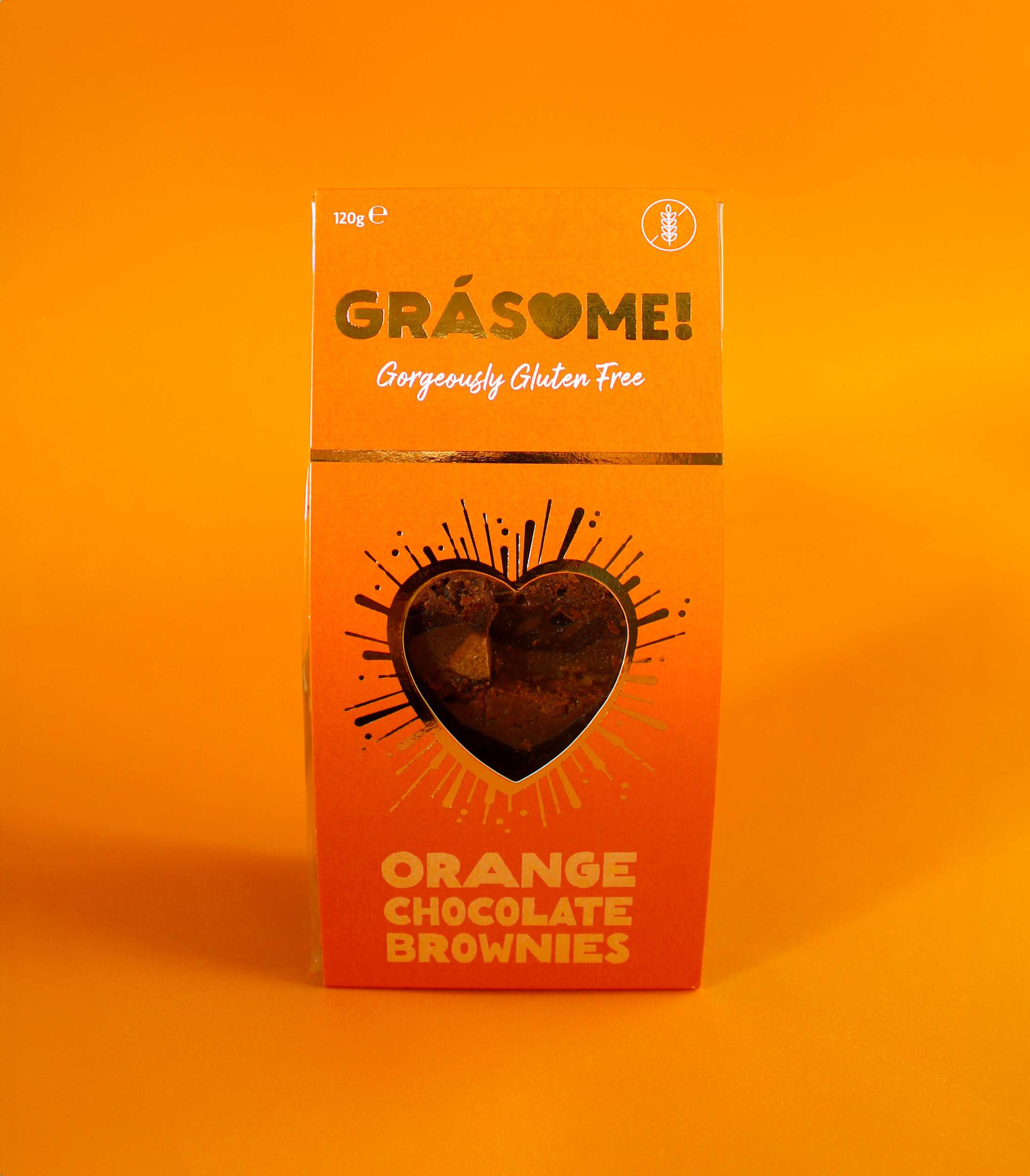
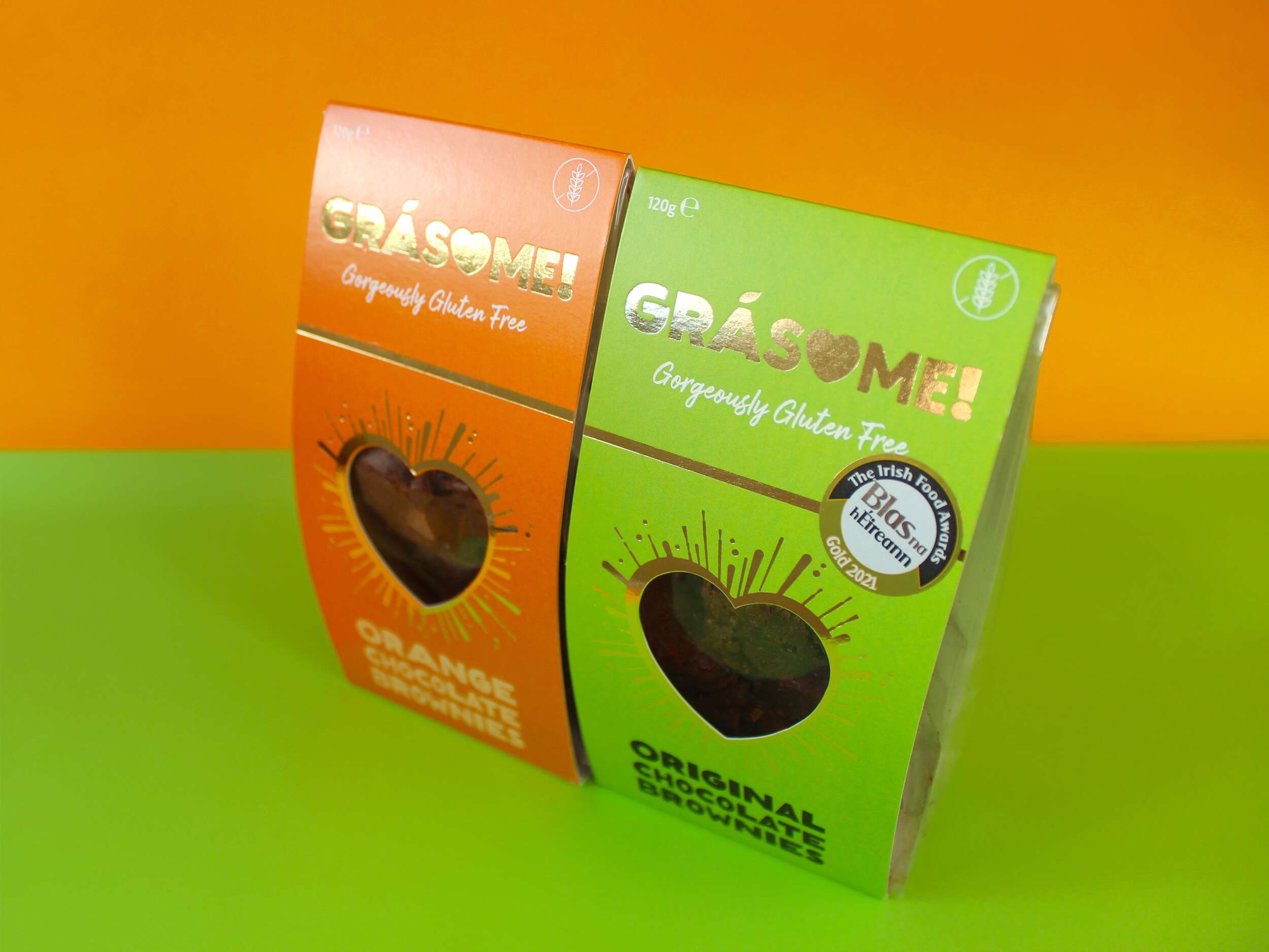
The colour palette is designed to be bright and vibrant, reflecting the client’s ethos of living life to the fullest and embracing boldness. It ensures the product stands out on the shelf, commanding attention rather than blending into the background. Each flavour is represented by a distinct, vivid hue—green for the original flavour and orange for the orange variety—highlighting the brand’s playful and energetic character. The use of gold foil adds a touch of luxury, reinforcing the high quality of the products while maintaining a warm, approachable aesthetic.
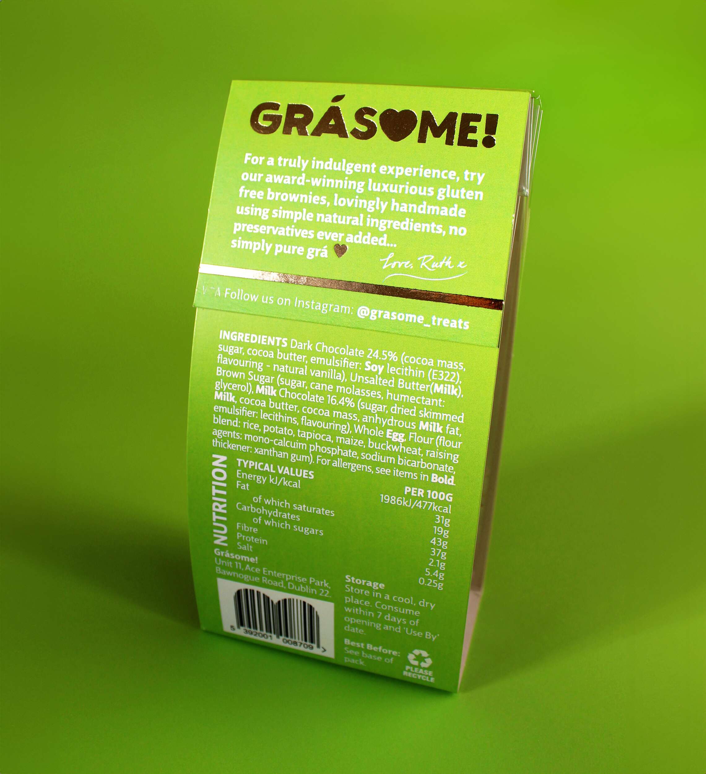
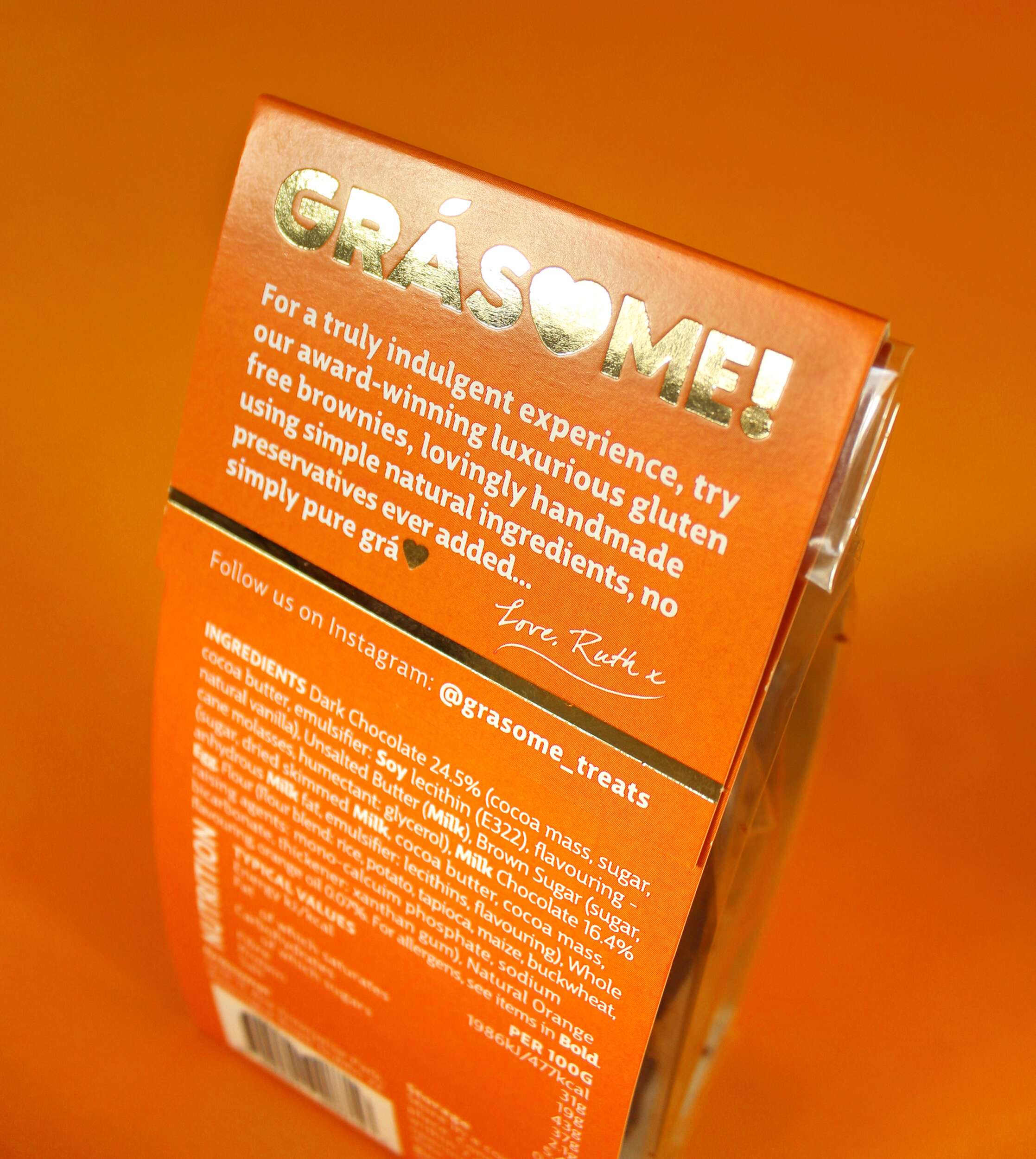
The packaging design features a cardboard sleeve with a heart-shaped cutout on the front, mirroring the heart in the logo. This allows the consumer to catch a glimpse of the brownies inside, creating an instant emotional connection. Gold foil lines radiate out from the heart cutout in a celebratory style, further enhancing the premium feel. The back of the packaging includes a personal note from Ruth, inviting consumers to share in the love and care she pours into her products:
“For a truly indulgent experience, try our award-winning luxurious gluten-free brownies, lovingly handmade using simple natural ingredients, no preservatives ever added… simply pure grá.
Love, Ruth x”
Sustainability is a key pillar of the Grásome! brand, reflected in the fully recyclable packaging. This aligns with Ruth’s values and her personal experiences living in eco-conscious environments like New Zealand and Antarctica. The reusable delivery boxes also emphasize the brand’s commitment to reducing waste.
The primary typeface, Big City Grotesque Pro, provides a clean, modern look, ensuring legibility and consistency across all brand materials. To balance this with a more playful touch, HelloMixed, a quirky, display font, is used for headings and flavour titles, mimicking the playful and earthy nature of the brand. Arsilon, a handwritten font, is reserved for smaller descriptors like “Gorgeously Gluten Free,” adding a personal, friendly feel to the packaging and marketing collateral.
Grásome! successfully redefines the perception of gluten-free products, celebrating them as indulgent, luxurious, and full of character. A proud finalist in the 2024 Irish Quality Food and Drink Awards, the brand stands as a testament to Ruth’s deep-rooted love of food, family heritage, and personal journey in mastering gluten-free baking. Through thoughtful design and a playful yet elegant brand identity, Grásome! communicates its promise to deliver treats that are not only delicious but also made with love, care, and passion. The packaging itself becomes part of the experience, making Grásome! treats perfect for sharing, gifting, or savoring all to oneself.
In a competitive gluten-free market, Grásome! proudly stands out as a brand that marries luxury and fun, offering consumers a product that doesn’t compromise on quality, style, or taste.
Follow Grásome! online:
Instagram: @grasome_treats
Twitter / X: @Grasome_treats
Website: Grásome Website
Packaging printed by Esmark Finch:
Instagram: @esmarkfinchprintandpackaging
Facebook: @Esmark-Finch-Print-and-Packaging
Website: Esmark Finch


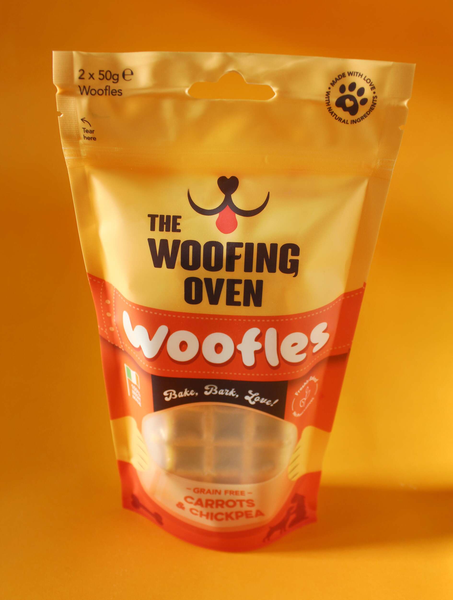
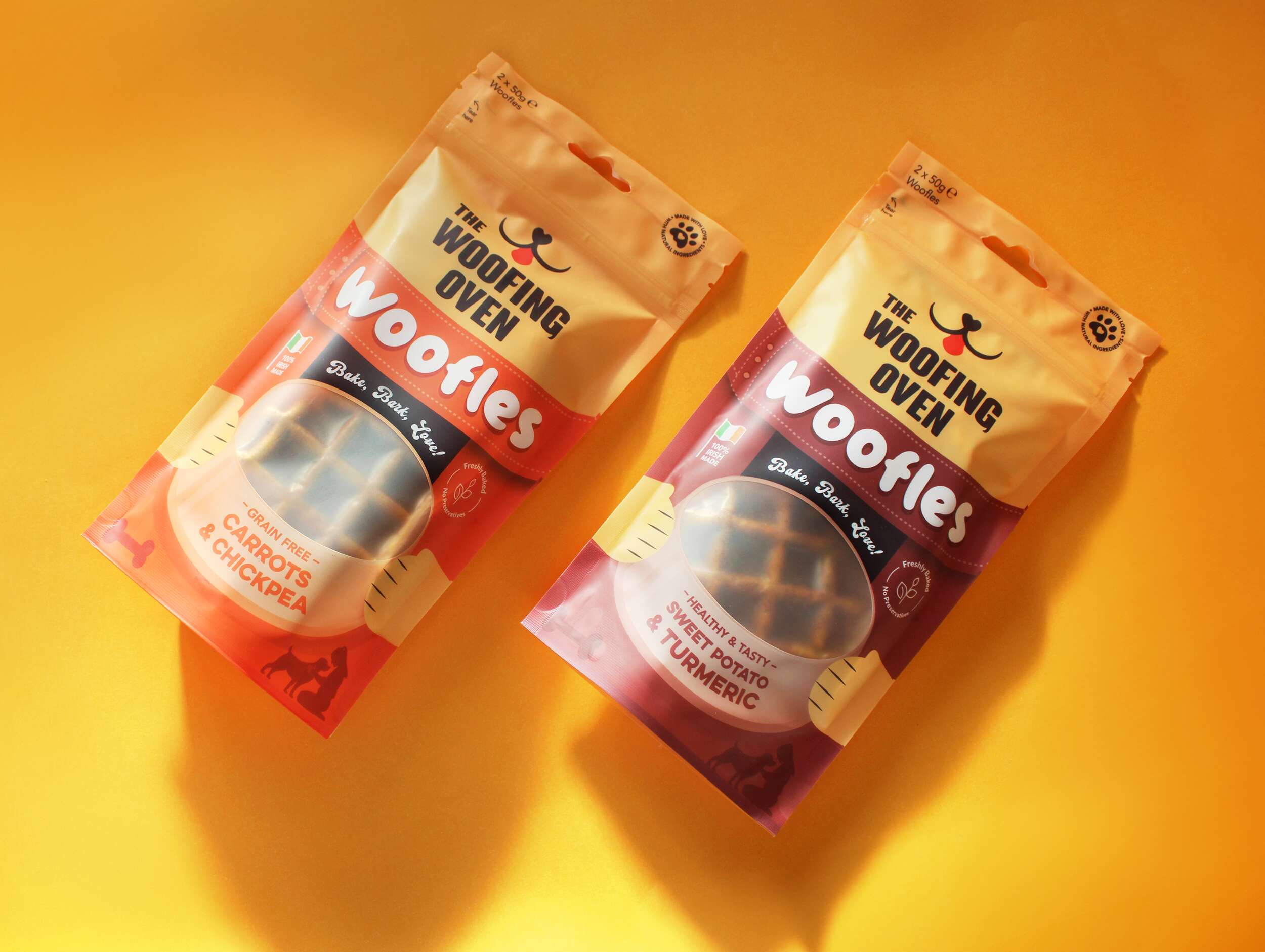
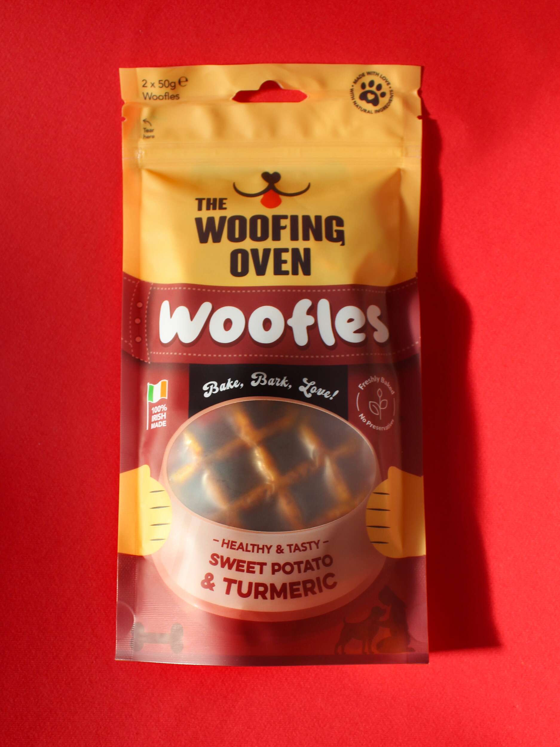
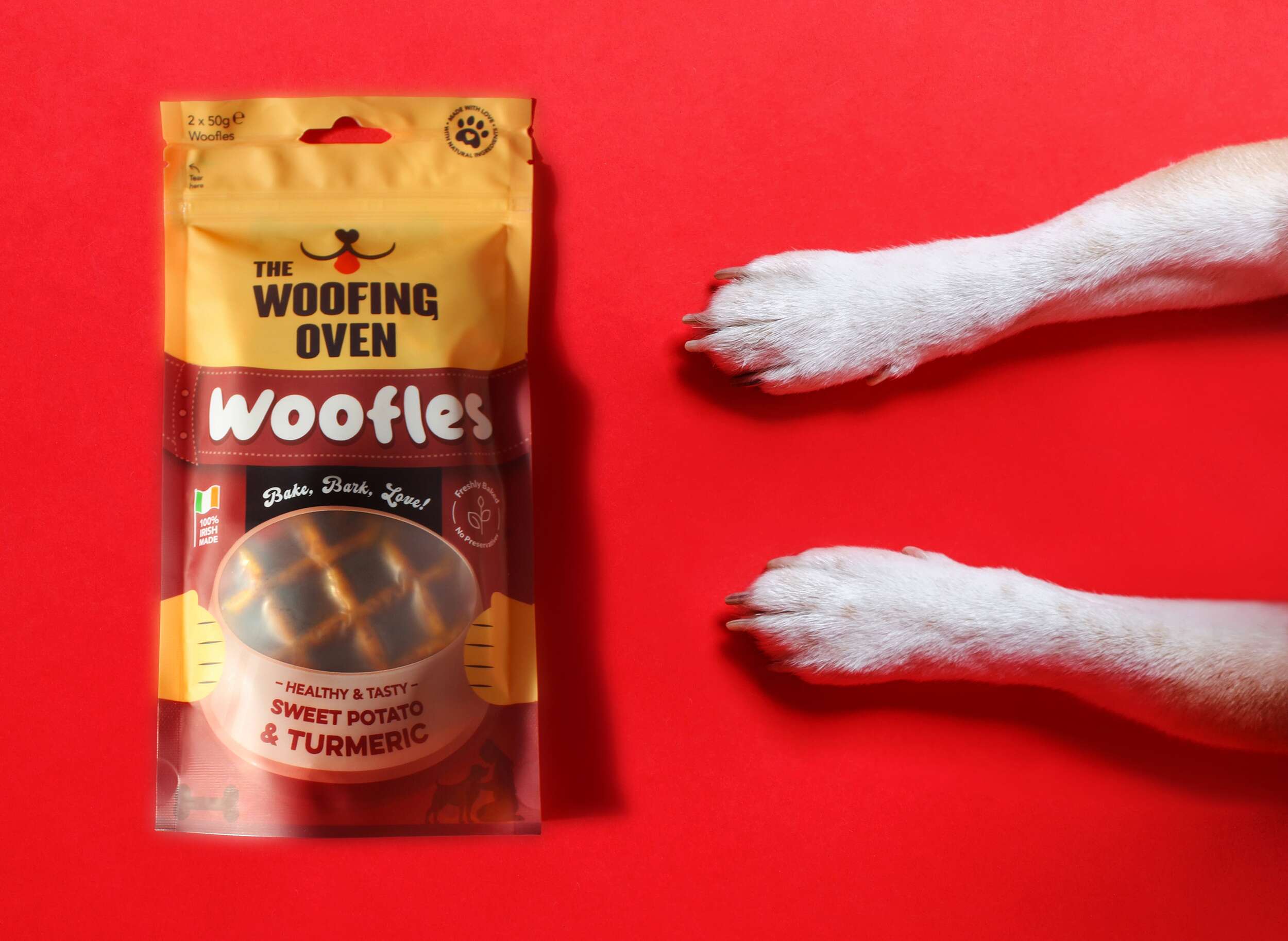

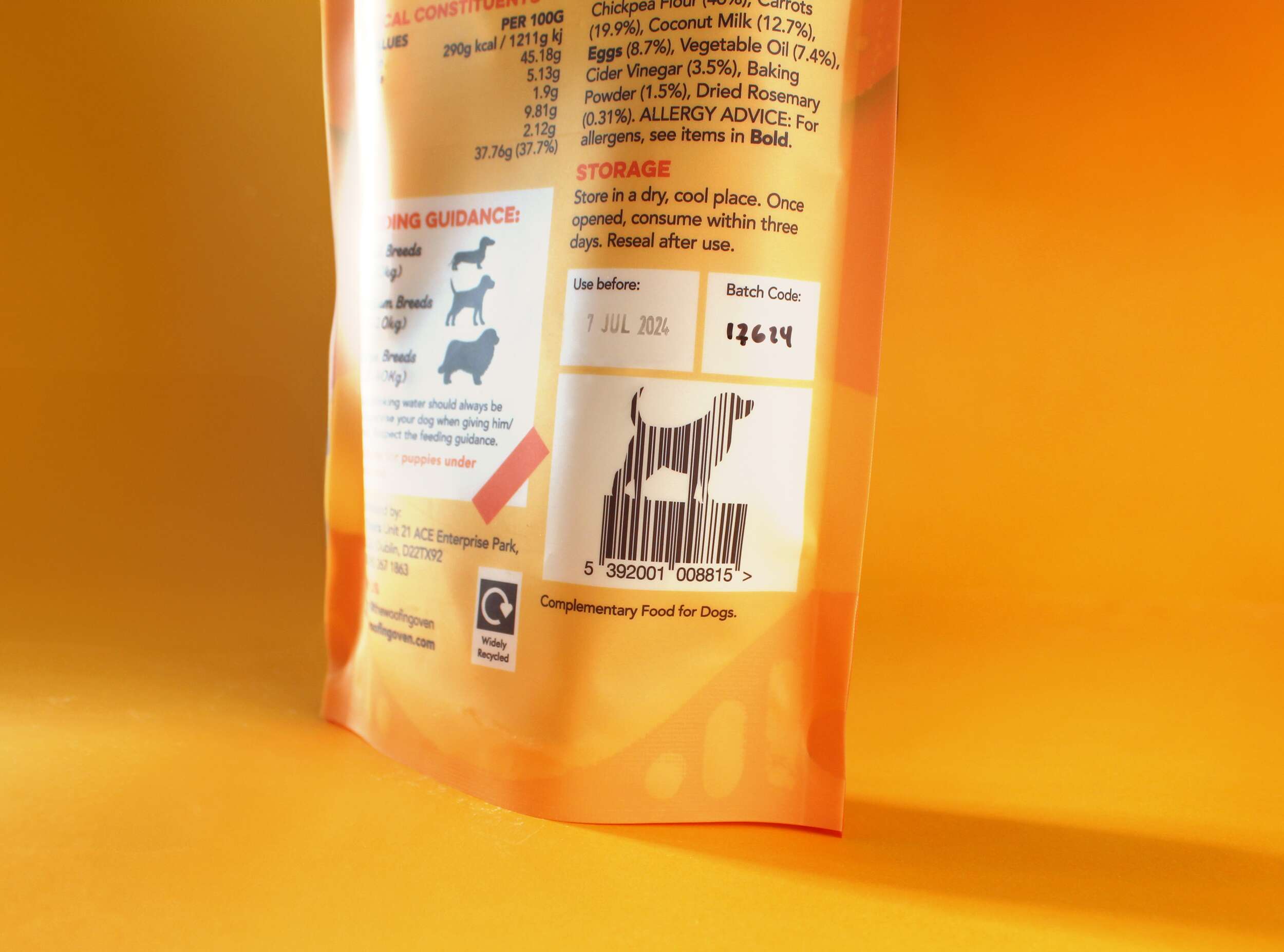
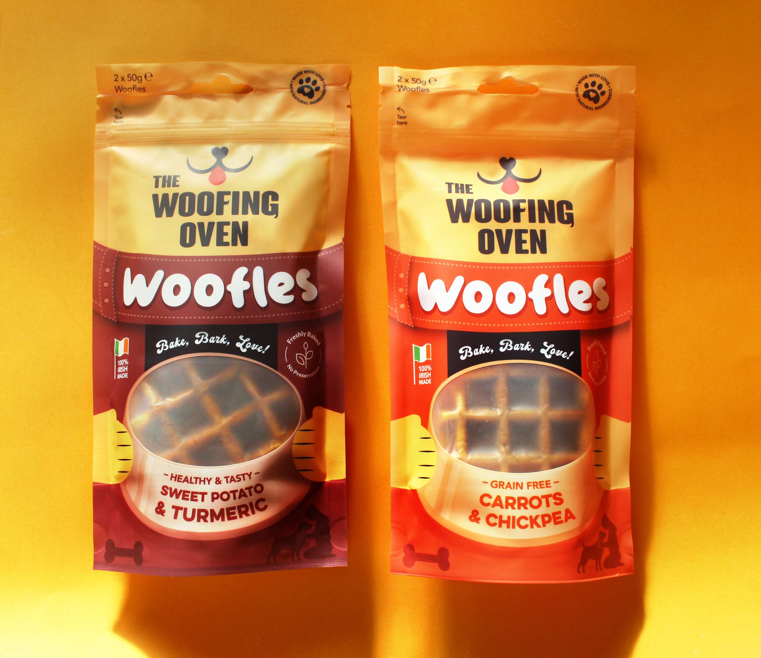
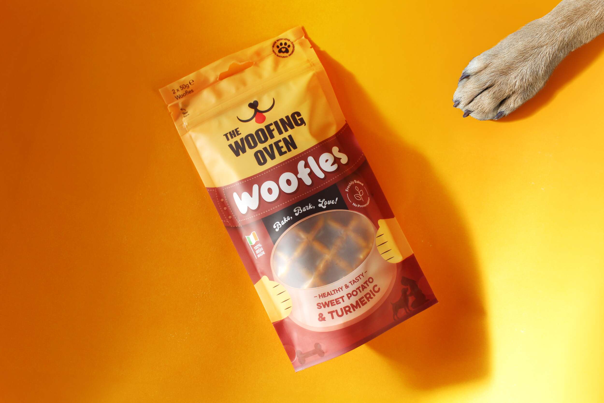
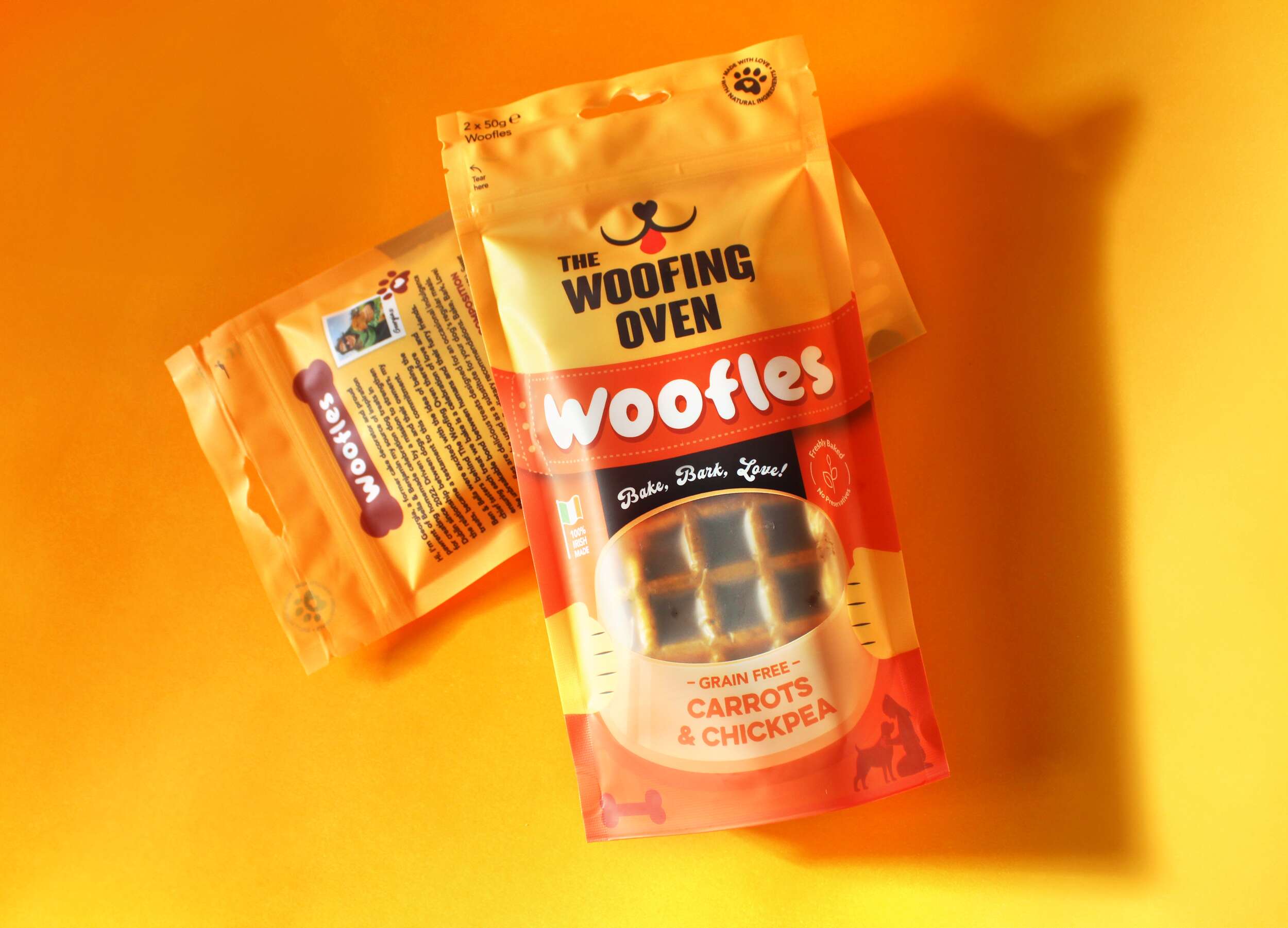
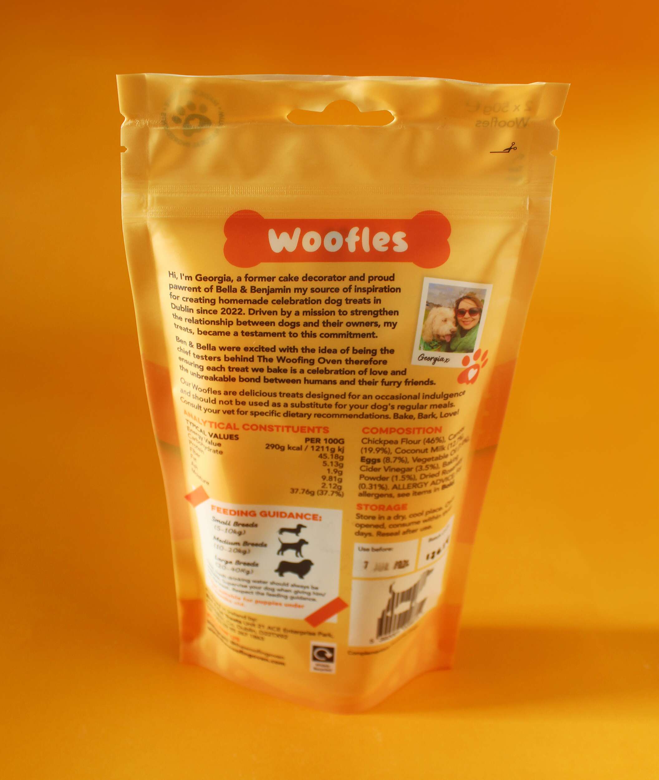
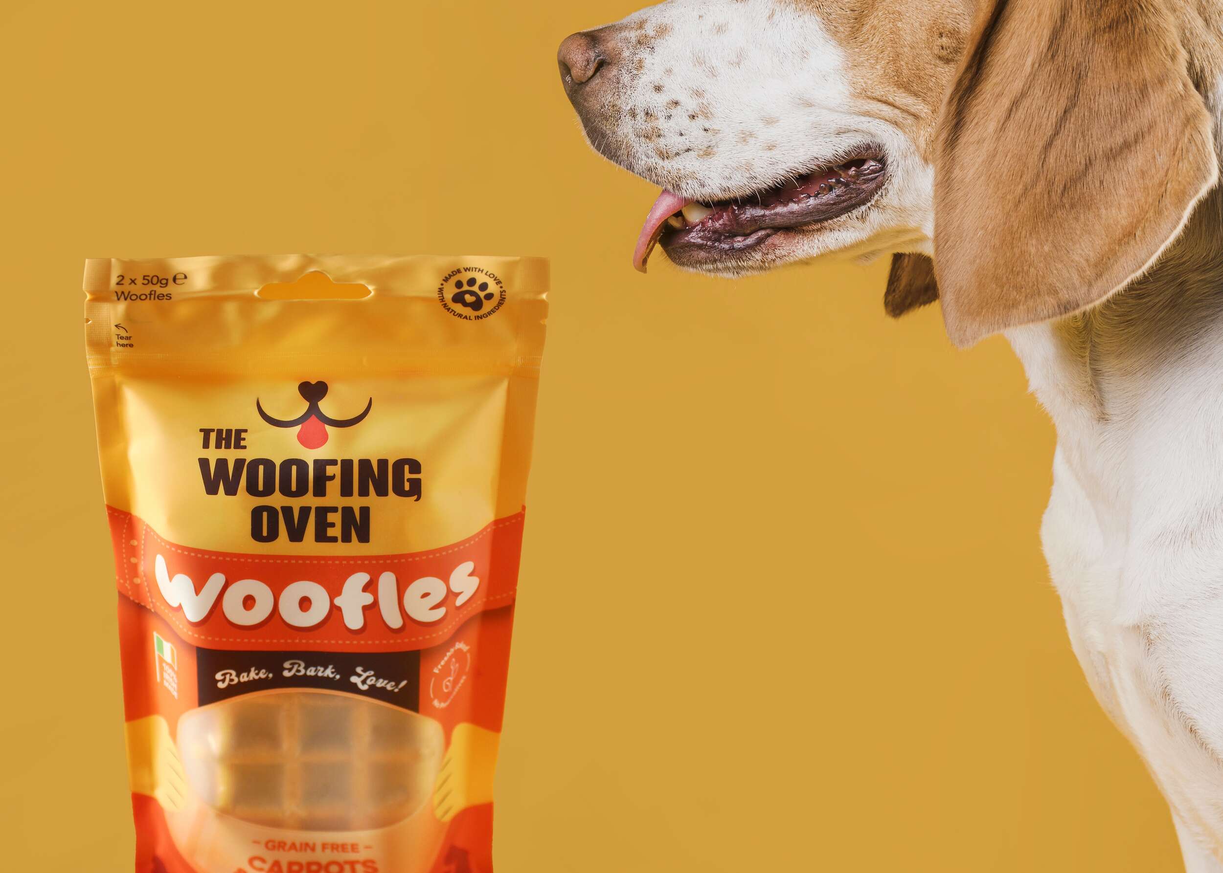
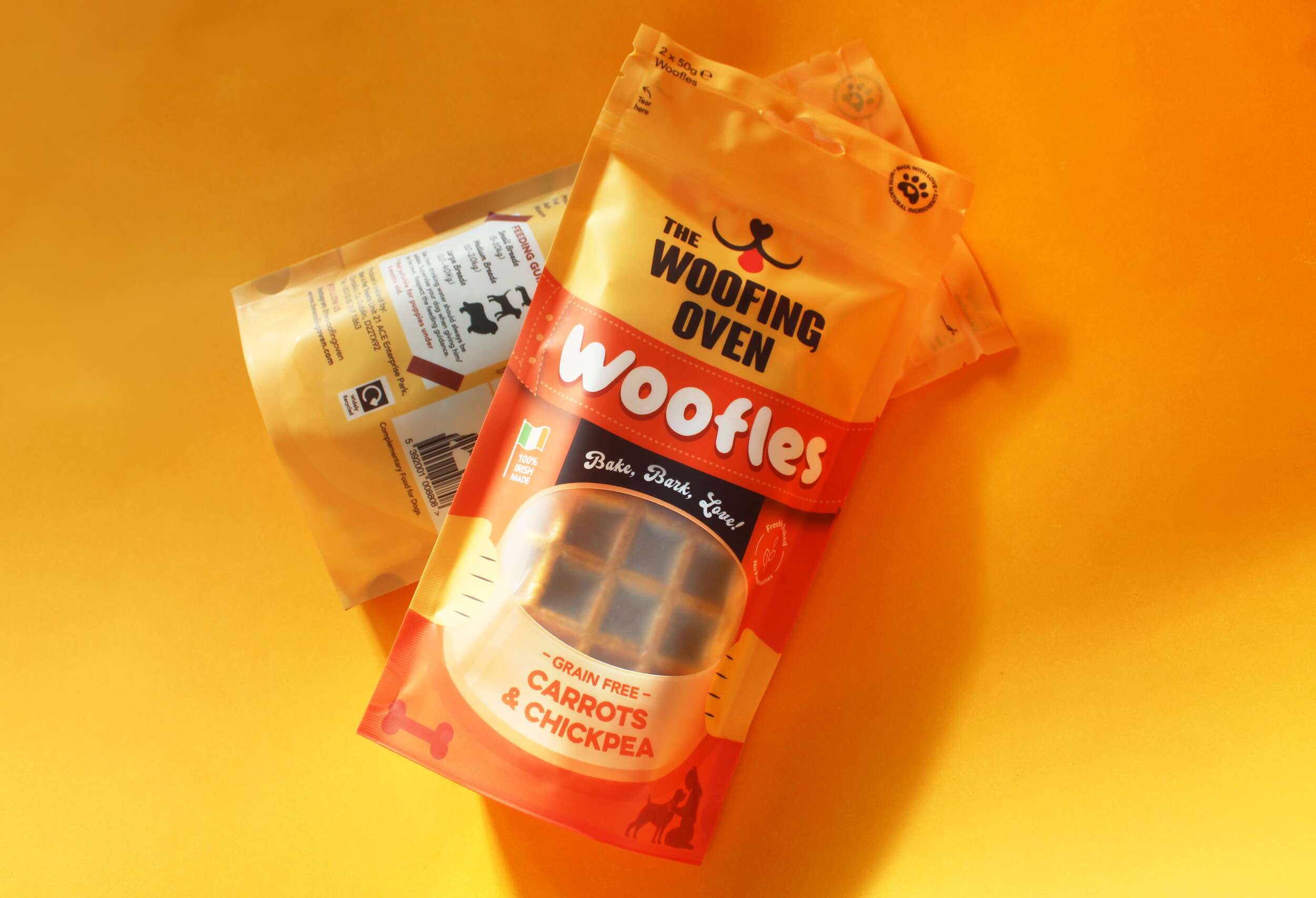
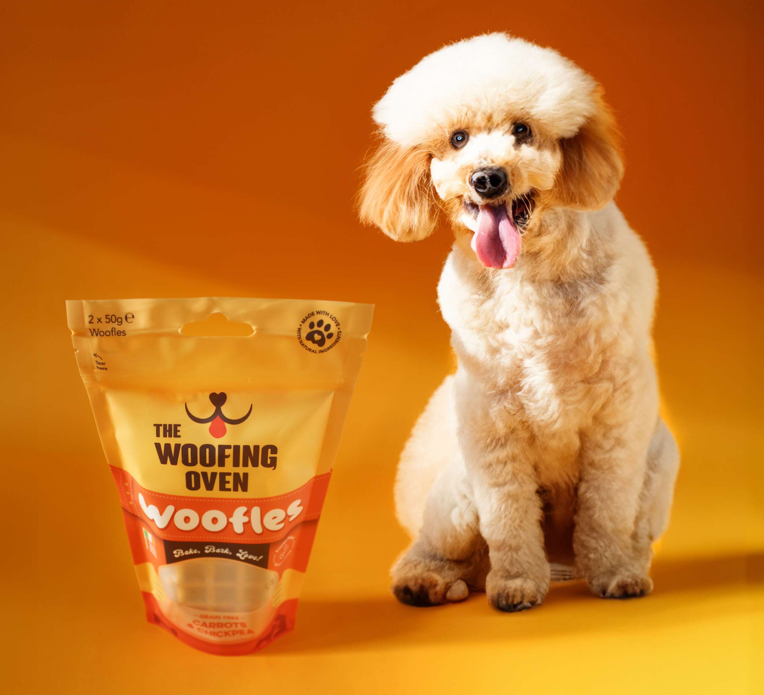 The Woofing Oven’s packaging design challenge was to create a visually striking, retail-ready package that reflects the brand’s fun, celebratory nature while emphasizing its commitment to quality, natural ingredients, and Irish craftsmanship. The existing brand (formerly known as Bon A Pet Treats) needed a fresh identity that would stand out in a crowded dog food aisle, making the transition from local markets to mainstream retail.